
Brand identity refresh and website redesign for Saint James Music Academy.
Opening its doors to Vancouver’s Downtown Eastside (DTES) in 2007, Saint James Music Academy (SJMA) is a non-profit children’s and youth music academy. They are committed to social transformation through music and practice modelling healthy community life through their orchestral and choir-based approach.
As the academy has grown to become recognized beyond the DTES, there was an opportunity to develop a refreshed Brand Identity that resonates with and unifies a clear message to the students and the community.
Railyard Lab 2019
This was a client project completed in October 2019 during my internship at Railyard Lab.
Project Type
Branding, UX/UI Design, Web Development
Roles
Project Management, User Research, Brand Strategy, UX/UI Design, Content Strategy, Web Development
Tools
Pen & Paper, Adobe Creative Suite, Keynote, Figma, Wordpress
Team
Elena Hsu, Joanne Chen, Jonathan Reade, and Mica Pfeffer
Brand Identity
Reflecting joy, pride, and musical excellence.
After 13 years of becoming a recognized music academy, SJMA Founder, Kathryn Walker wanted a refreshed brand identity that reflects the quality of music education that SJMA provides. My team and I were asked to create an identity that students could be proud of—something that was bold, bright, and fun, but that also portrayed the academy’s strive for musical excellence.
As the Brand Strategist, I was responsible for crafting an emotionally-compelling narrative around SJMA’s values, vision, and unique qualities. This is embodied by the mission statement and tagline.
“Located in the Downtown Eastside of Vancouver, we are a non-profit orchestra and choir-based music academy. We give our children the opportunity to discover their potential and the wonders of music by creating a community of learning, where children and youth collaborate together and celebrate achievement.”

The tagline, “A Musical Life”, is an artistic expression of SJMA’s brand; It reflects their orchestral and choir-based approach to modelling healthy community life, as well as their advocacy for various aspects of life outside of music. It also encapsulates the qualities and life values that music brings—joy, love, dedication, and teamwork.
Capturing the joy of music.
Being a recognized organization within the community, it was important to retain and honour the sentiment of SJMA’s original logo icon (below left)—floating musical notes inside a tree that has become the symbol of gathering together.
The refreshed identity (below right) features a tree silhouette created by music notes from the original icon. Vibrant colours of raspberry, sky turquoise, and golden yellow collide in harmony to mirror the joy of creating and experiencing music.
Representing SJMA’s credibility, the original delicate serif logotype is given a confident makeover with a bold sans-serif typeface. A lowercase ‘i’ is used within the logotype to represent the humility of collaborative music-making, while recognizing each child as an individual within the greater whole.


UX Strategy
As a grassroots organization, SJMA relies heavily on their website to engage community members and garner support. The key goals for the new website was to generate more online donations and streamline the experience for SJMA’s various audiences.
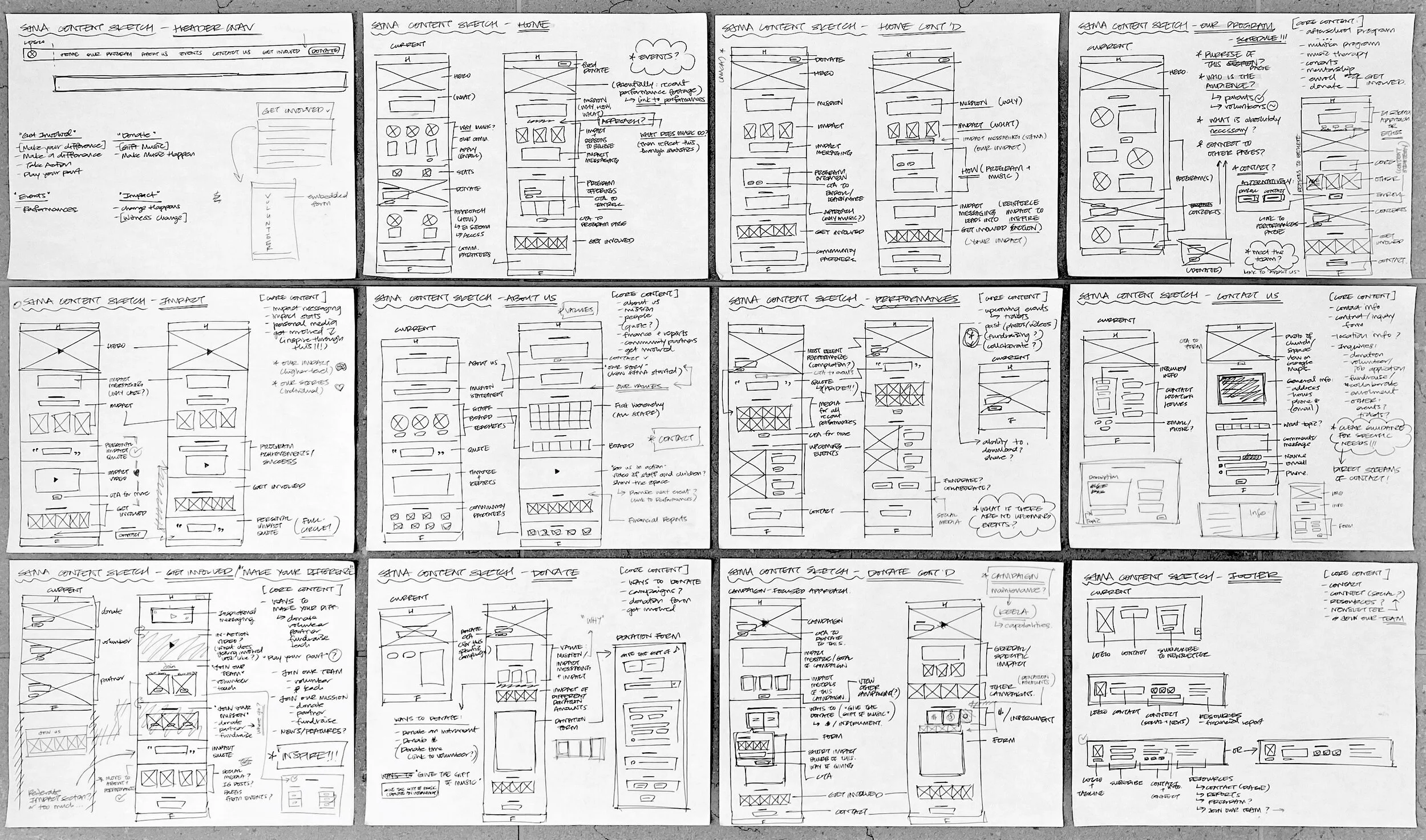
As the UX Strategist and User Researcher, I was responsible for conducting a UX audit of the original website, developing user personas, and building detailed journey frameworks to inform the design of the website.
Designing for donors.
User Personas (shown below) were compiled to outline the specific brand expectations and motivations of each group. When designing for the needs of the primary donor persona, Cheryl, it was necessary to:
Highlight and provide meaningful ways of contributing.
Demonstrate how contributions impact SJMA’s children and community.
Clearly communicate SJMA’s mission and values as reasons to believe.
To design for these needs, my team and I leveraged insights from NextAfter, an online research lab that helps non-profit organizations improve their reach, acquire more donors, and generate more online donations. According to NextAfter’s research, organizations can improve online donor conversions by:
Presenting a clear value proposition that is supported by immediately visible results.
Using personal, descriptive language for labelling donation actions.
Leveraging tangible donation language and images to help illustrate impact.
Streamlining the donation process by reducing the amount of choices and decision-making points.


Web Design & Development
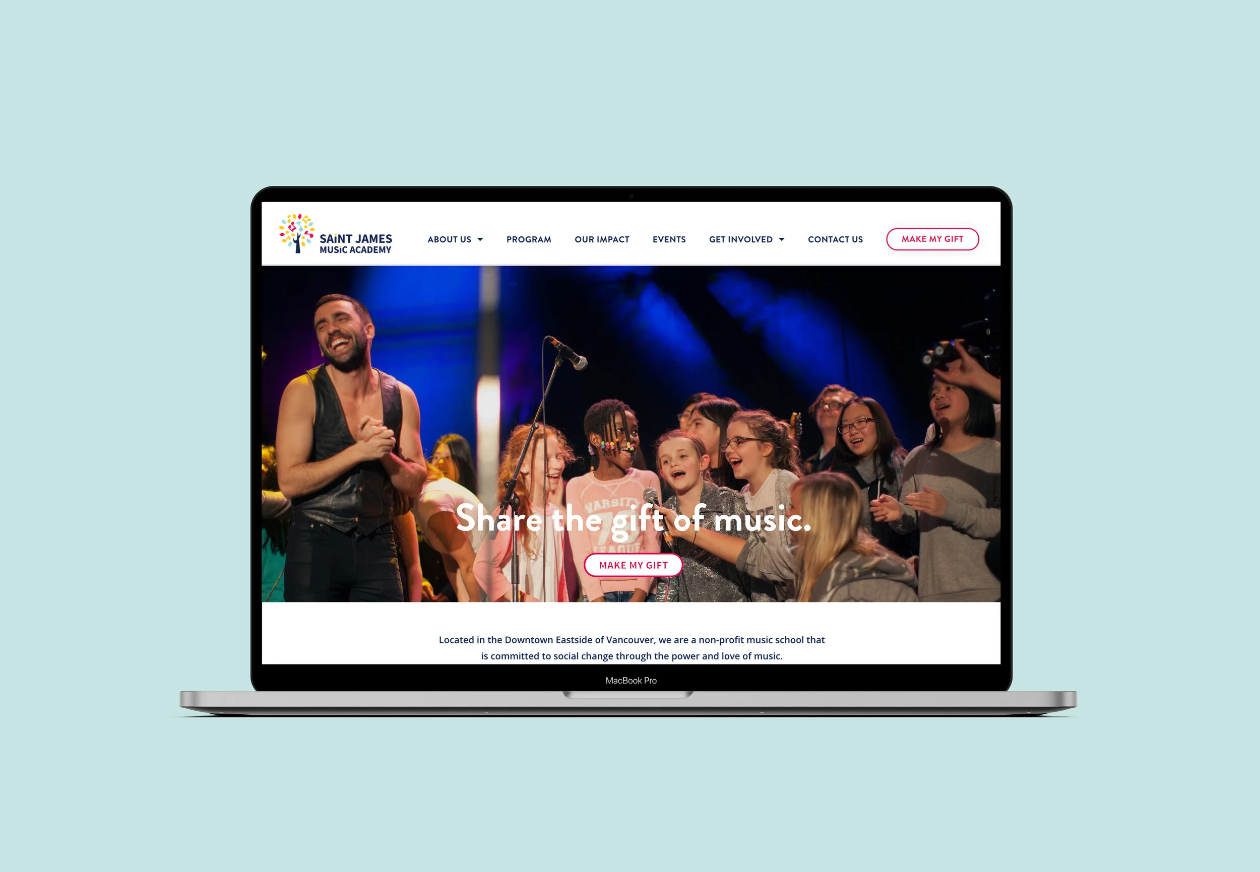
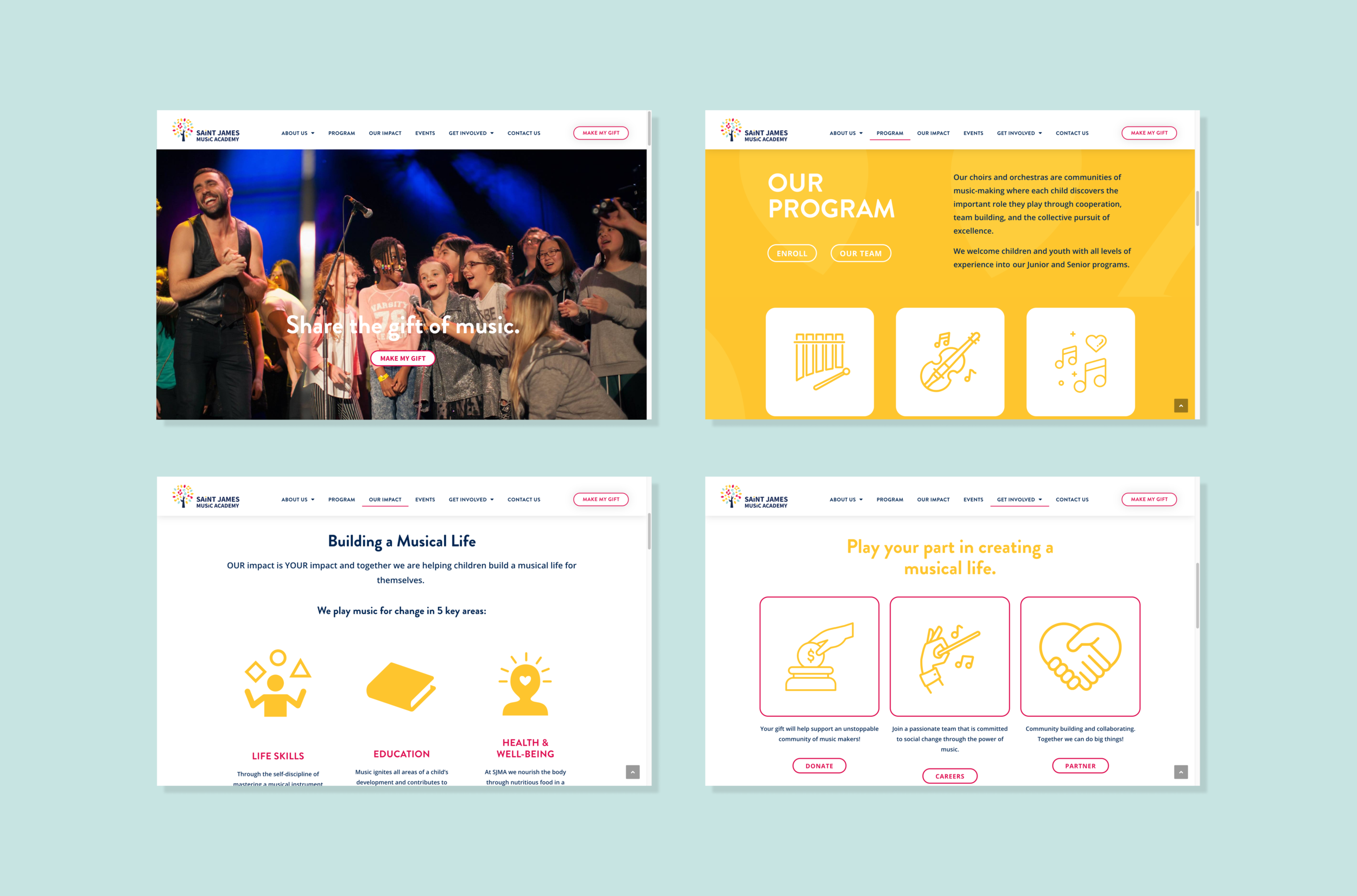
Streamlining the experience.
As a UX/UI Designer, my responsibilities included restructuring the information architecture to streamline the experience for each persona, creating wireframes and mockups (shown below), paper prototyping, and conducting user tests to refine the design.
Developing an intuitive design for long-term maintenance.
To develop the website on WordPress, I used Elementor Pro—an intuitive drag-and-drop website builder that allows for the creation of custom content blocks and page templates, including type, image, and interaction styles; This would facilitate the hand-off of the website to SJMA’s team to maintain over time.
Implementing tools to optimize donations.
To optimize donations, I implemented Keela—a robust non-profit software that allows organizations to elevate their donation processes through custom forms, donor insights, email campaigns, and seamless integration with secure payment tools. Contributing to a seamless web experience, I created and embedded a simple step-by-step donation form to remove unnecessary redirects to external donation tools, as the original website had.

Lo-fi mockup: Home/Landing
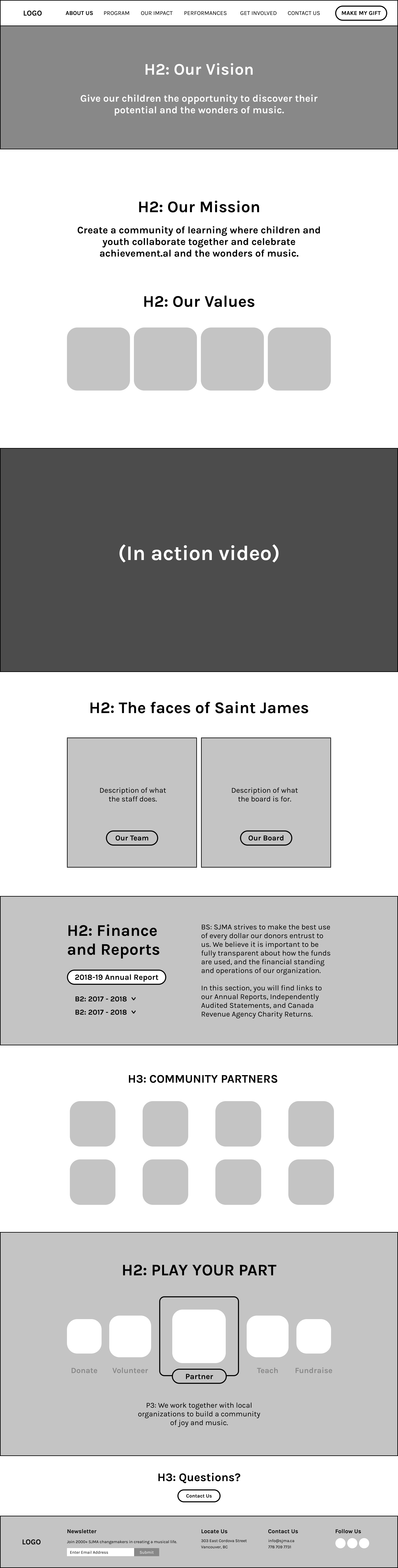
Lo-fi mockup: About Us

Lo-fi mockup: Our Impact

Lo-fi mockup: Programs

Lo-fi mockup: Programs Description

Lo-fi mockup: Performances

Lo-fi mockup: Make Your Gift (Donate)

Lo-fi mockup: Fundraise